3 Chapter 3
3.1 Chapter 3.2.4 Exercises
3.1.1 Question 1: Run ggplot(data = mpg). What do you see?

This line of code does not output a graph as there is no geom function to tell R studio what to output. Need ‘+ geom_point(mapping = aes(x = displ, y = ’variable’))’ to see anything
3.1.2 Question 2: How many rows are in mpg? How many columns?
234 rows, 11 columns
3.1.3 Question 3: What does the drv variable describe? Read the help for ?mpg to find out.
drv = the type of drive train, f = fwd, r = rwd, 4 = 4wd
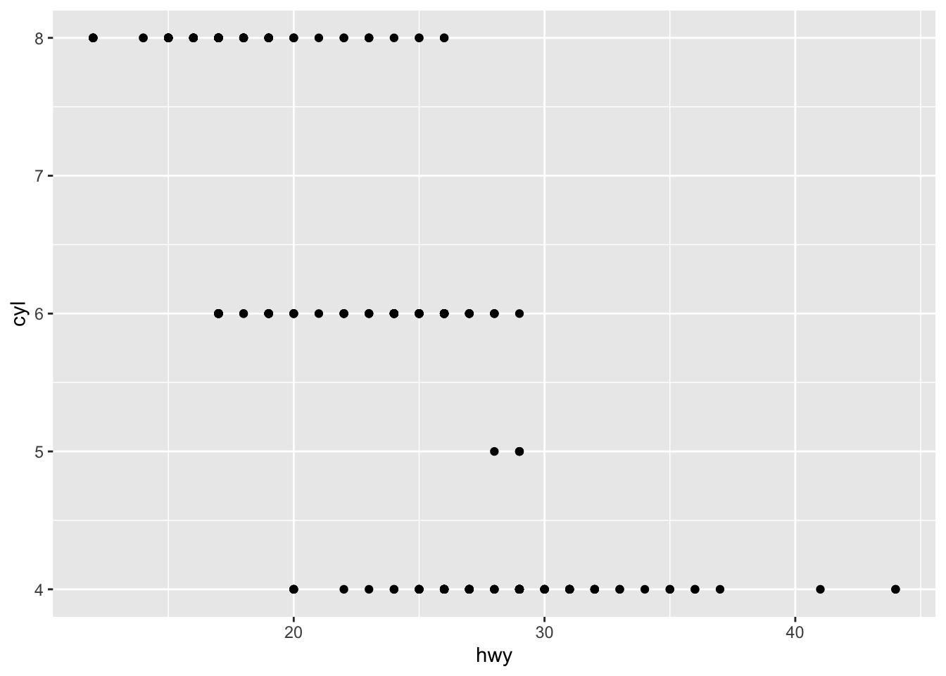
3.1.4 Question 4: Make a scatterplot of hwy vs cyl.
3.1.5 Question 5: What happens if you make a scatterplot of class vs drv? Why is the plot not useful?
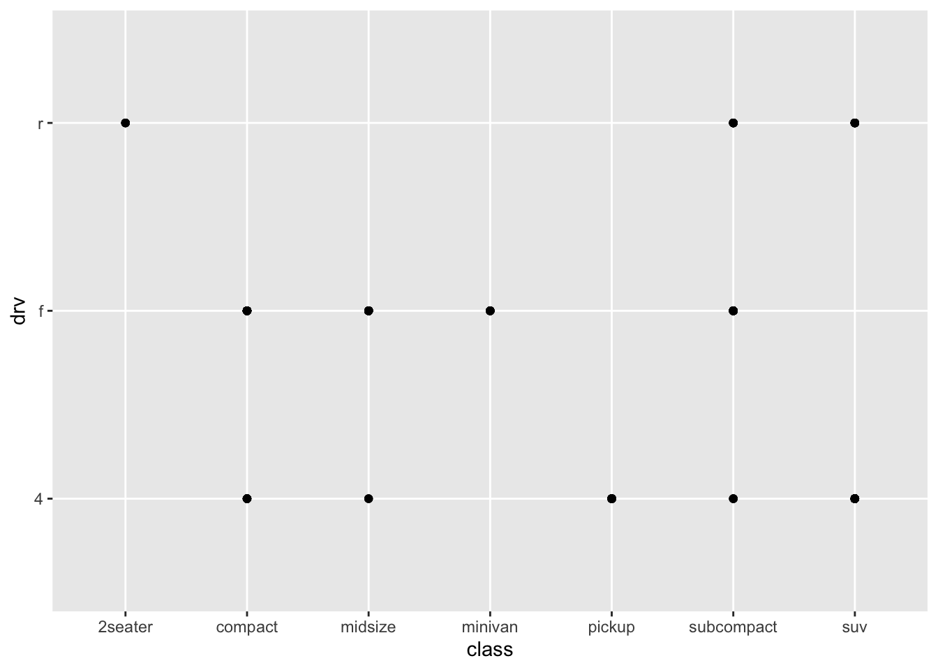
This is not helpful because there are no numerical values in class or drv so a scatterplot wouldn’t be a good way to visualize this data.
3.2 Chapter 3.3.1 Exercises
3.2.1 Question 1: What’s gone wrong with this code? Why are the points not blue?
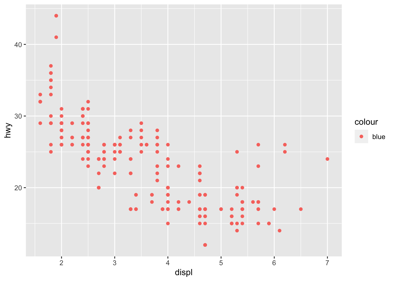
#this is incorrect because there is a missing parenthesis after hwy. should be:

ggplot(data = mpg) +
  geom_point(mapping = aes(x = displ, y = hwy), color = "blue")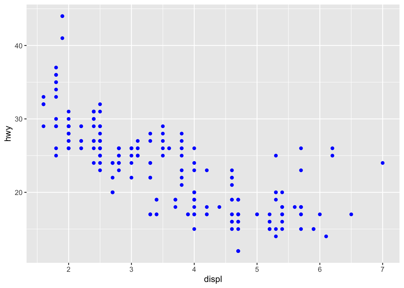
3.2.2 Question 2:Which variables in mpg are categorical? Which variables are continuous? (Hint: type ?mpg to read the documentation for the dataset). How can you see this information when you run mpg?
categorical variables: manufacturer, model, trans, drv, fl, class continuous variables: displ, year, cyl, cty, hwy
you can see this when you run mpg under the columns where it displays the type of variable (cat =
3.2.3 Question 3:Map a continuous variable to color, size, and shape. How do these aesthetics behave differently for categorical vs. continuous variables?
ggplot(data = mpg) +
  geom_point(mapping = aes(x = displ, y = hwy, size = displ, color = year, shape = cyl))
## Error: A continuous variable can not be mapped to shape
you can’t map a continuous variable to shape
ggplot(data = mpg) +
  geom_point(mapping = aes(x = manufacturer, y = model, size = model, color = trans, shape = class))
## Warning: Using size for a discrete variable is not advised.## Warning: The shape palette can deal with a maximum of 6 discrete values because more than 6 becomes difficult to
## discriminate; you have 7. Consider specifying shapes manually if you must have them.## Warning: Removed 62 rows containing missing values (geom_point).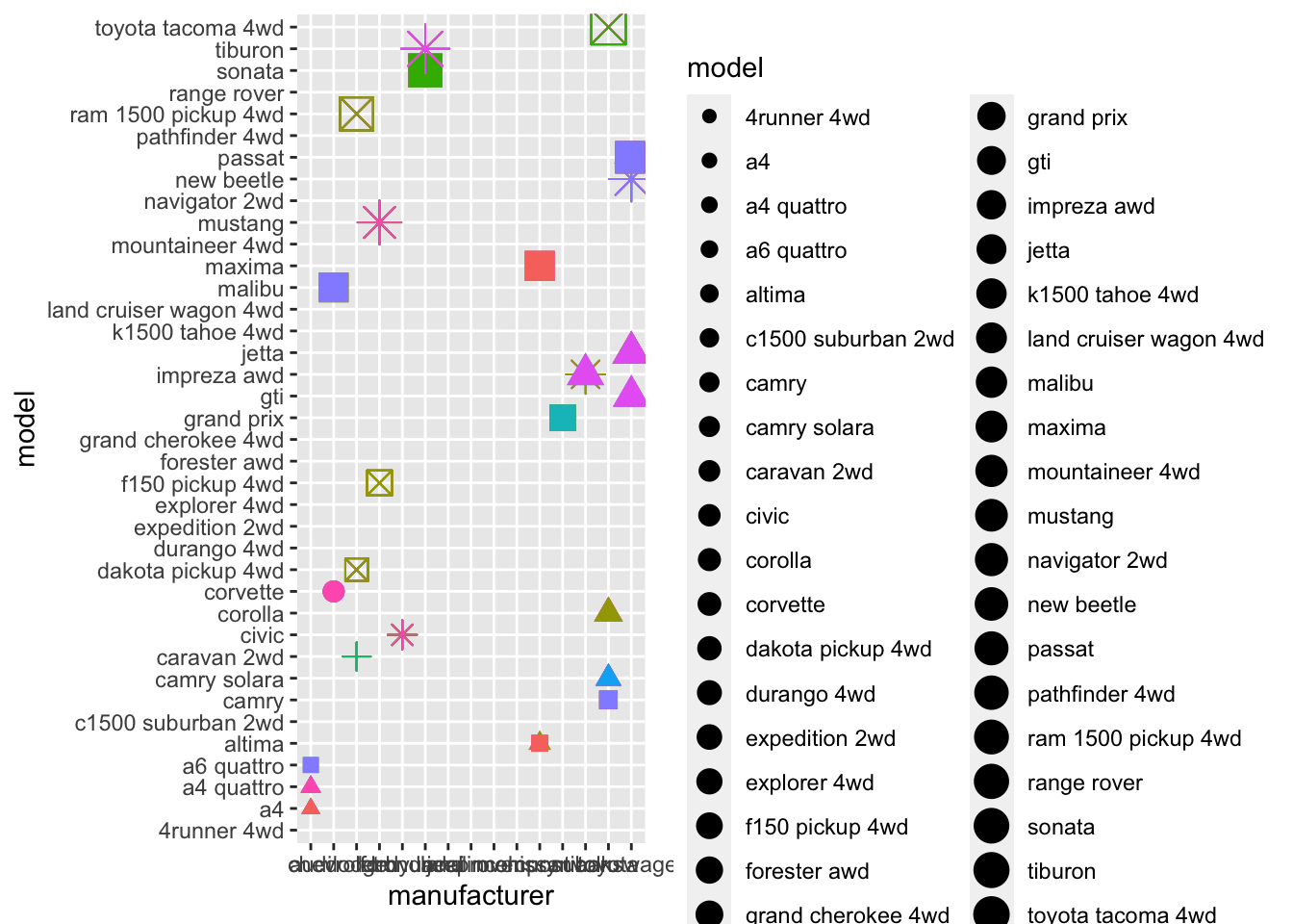
You shouldn’t use size for a discrete variable; the shape palette can only handle 6 values so any more doesn’t work well; asks you to specify shapes if you have to have them.
3.2.4 Question 4: What happens if you map the same variable to multiple aesthetics?
The points for what you are graphing each have a specific color, size, and shape.
ggplot(data = mpg) +
  geom_point(mapping = aes(x = manufacturer, y = model, size = class, color = class, shape = class))
## Warning: Using size for a discrete variable is not advised.## Warning: The shape palette can deal with a maximum of 6 discrete values because more than 6 becomes difficult to
## discriminate; you have 7. Consider specifying shapes manually if you must have them.## Warning: Removed 62 rows containing missing values (geom_point).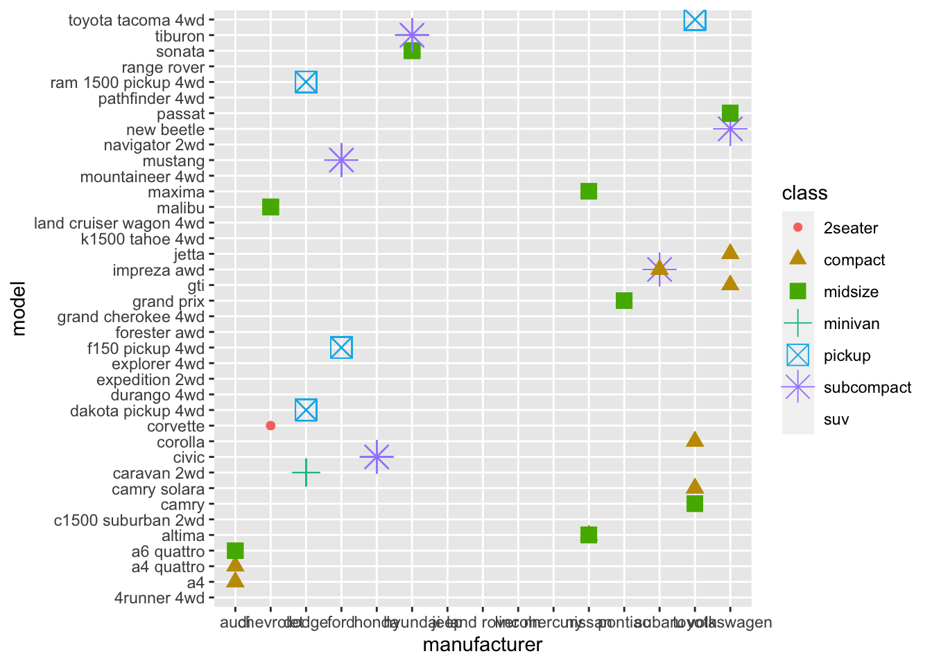
3.2.5 Question 5: What does the stroke aesthetic do? What shapes does it work with? (Hint: use ?geom_point)
if a shape had a border, stroke would control the width of the border
3.2.6 Question 6: What happens if you map an aesthetic to something other than a variable name, like aes(colour = displ < 5)? Note, you’ll also need to specify x and y.
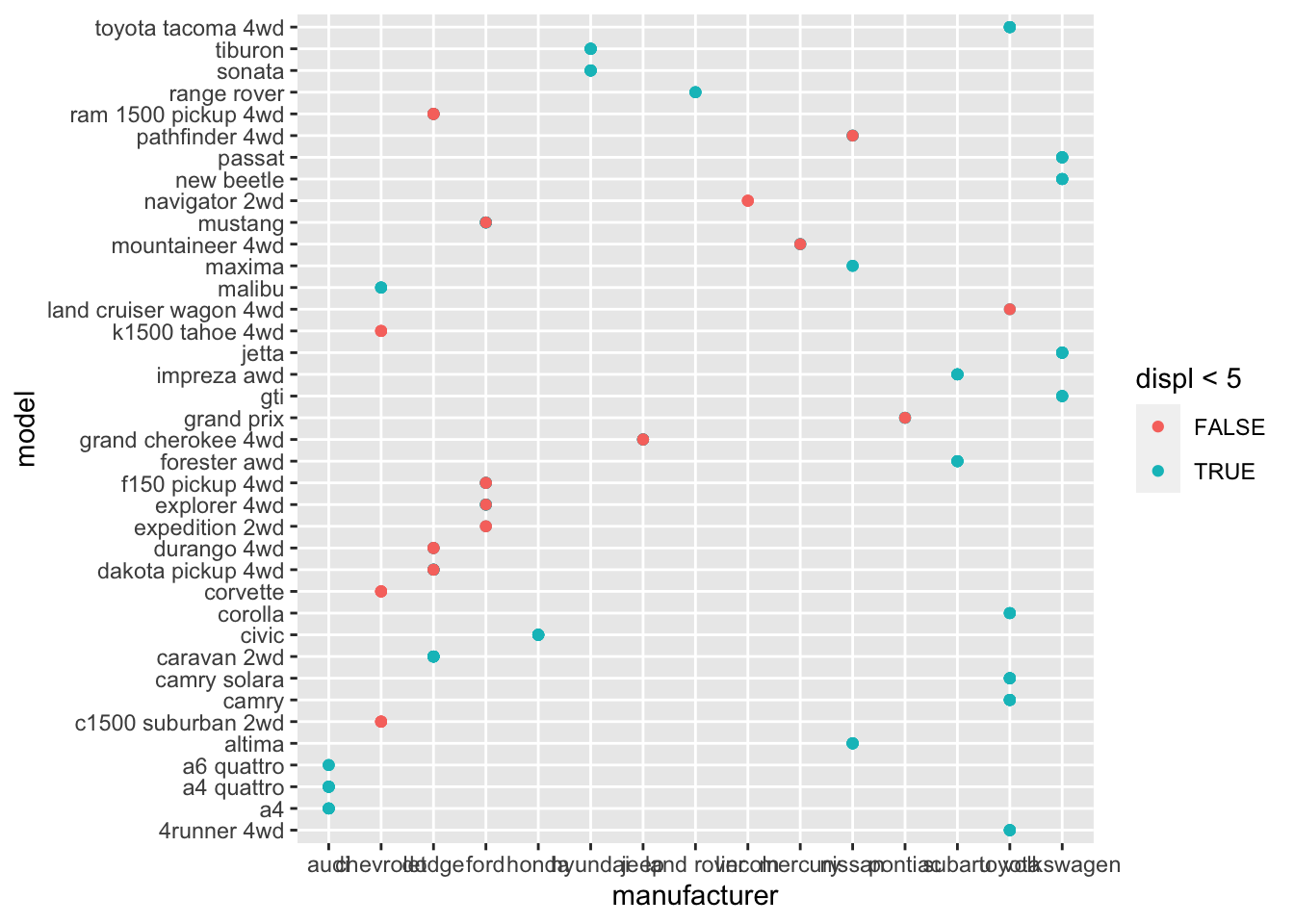
This colors the points based on if the condition displ < 5 is true or false
3.3 Chapter 3.5.1 Exercises
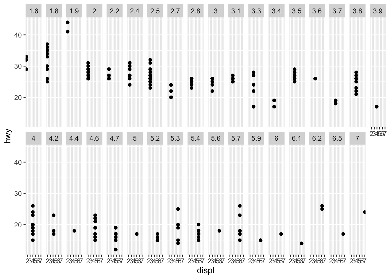
3.3.1 Question 1: What happens if you facet on a continuous variable?
Creates a new graph for each of the numbers in the continuous variable like displ, see below
3.3.2 Question 2: What happens if you facet on a continuous variable?
The empty cells in the plot with facet_grid(drv ~ cyl) show that there are no points that relate to both variables (cyl, drv). for example, for the cells with 5 cylinders and 4wd, there are no points so cannot plot the displ and hwy for it.
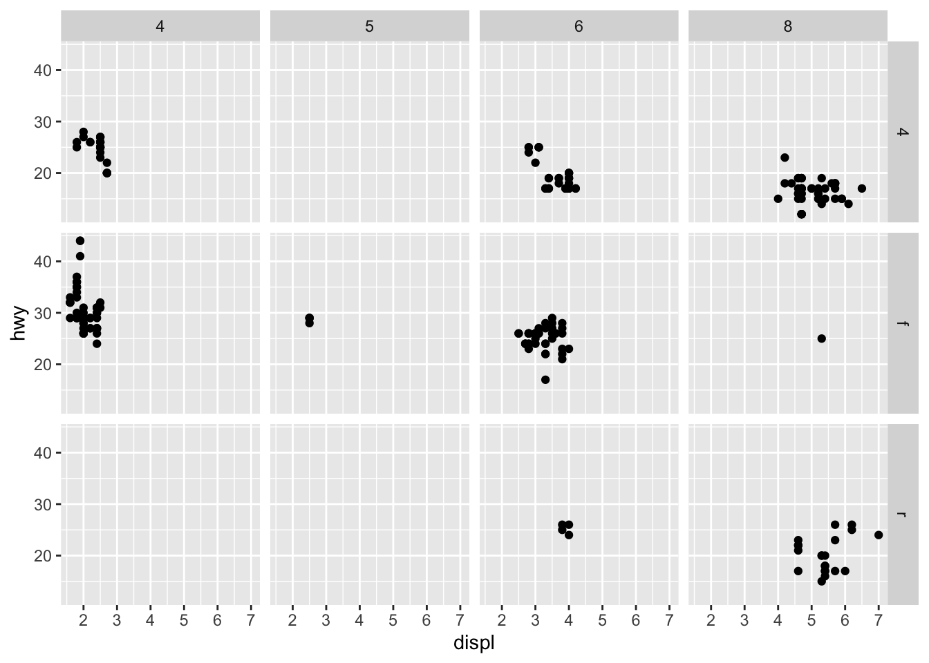
3.3.3 Question 3: What plots does the following code make? What does . do?
The ‘.’ determines where the drv axis will be (on the righthand side vs the top). It is the placeholder for the empty axis.
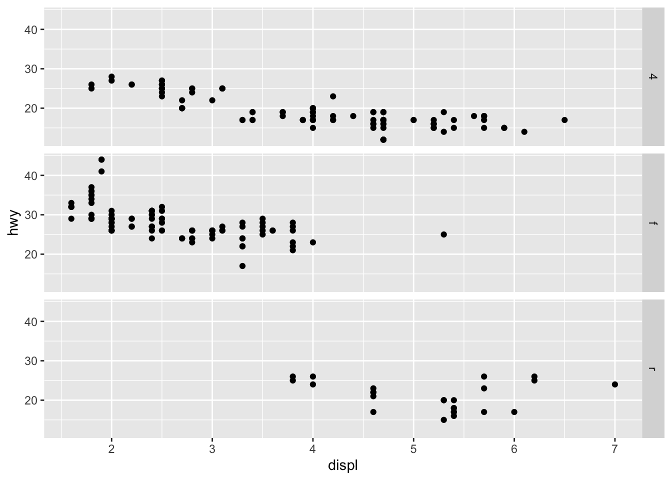
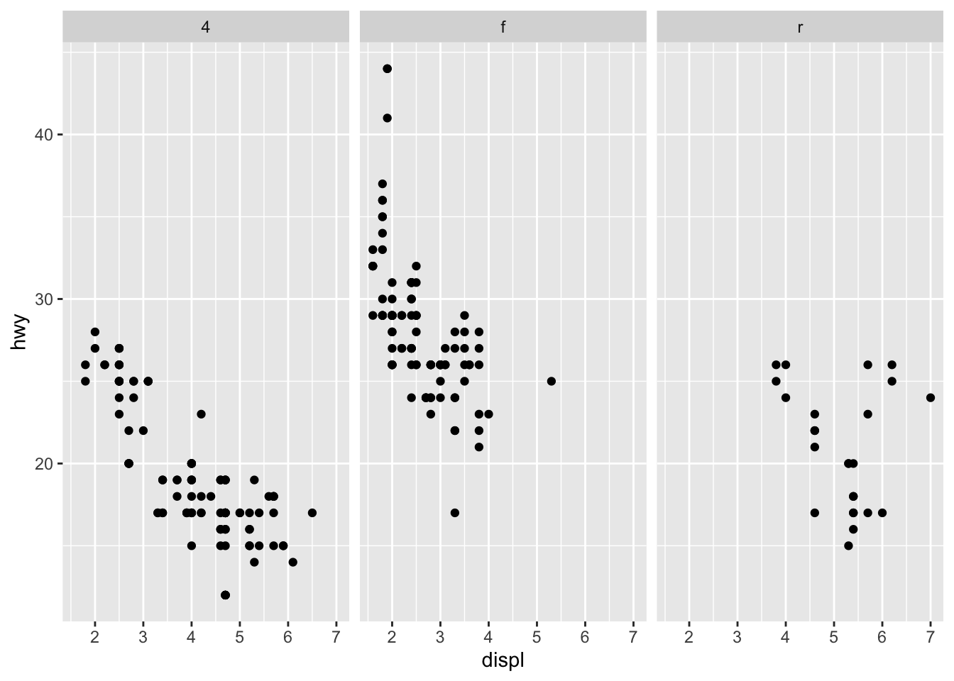
3.3.4 Question 4: Take the first faceted plot in this section. What are the advantages to using faceting instead of the colour aesthetic? What are the disadvantages? How might the balance change if you had a larger dataset?
The advantage of using facet wrap instead of color is that it allows you to more easily see differences in hwy and displ for each car type because they are separated into individual graphs. Especially for large datasets, it would be quite difficult to see all of one car types’ data points with color because they could overlap on the graph.
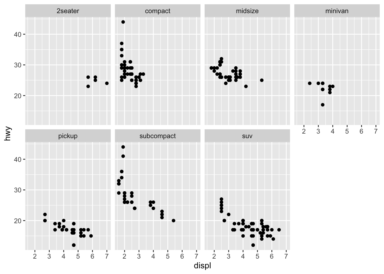
3.3.5 Question 5: Read ?facet_wrap. What does nrow do? What does ncol do? What other options control the layout of the individual panels? Why doesn’t facet_grid() have nrow and ncol arguments?
nrow is the number of rows, ncol is the number of columns. The other options that control the layout of the panels include: scales, shrink, switch, dir, strip.position. Facet_grid does not have nrow and ncol because it is creating a matrix of panels, and does not on its own have a specified number of columns and rows.
3.3.6 Question 6: When using facet_grid() you should usually put the variable with more unique levels in the columns. Why?
Because if you add more levels to the rows, the col axis (y-axis) would be shorter, meaning that it would be harder to see the actual values on the plots.
3.4 Chapter 3.6.1 Excersises
3.4.1 Question 1: What geom would you use to draw a line chart? A boxplot? A histogram? An area chart?
line chart: geom_smooth boxplot: geom_boxplot histogram: geom_histogram area chart: geom_area
3.4.2 Question 2: Run this code in your head and predict what the output will look like. Then, run the code in R and check your predictions.
ggplot(data = mpg, mapping = aes(x = displ, y = hwy, color = drv)) +
  geom_point() +
  geom_smooth(se = FALSE)
## `geom_smooth()` using method = 'loess' and formula 'y ~ x'
3.4.3 Question 3: What does show.legend = FALSE do? What happens if you remove it?
show.legend = FALSE will remove the legend key from the plot. If it is not there, the ggplot function assumes it should exist to describe the aesthetics for variables.
3.4.4 Question 4: What does the se argument to geom_smooth() do?
se shows the confidence interval around the smooth line
3.4.5 Question 5: Will these two graphs look different? Why/why not?
## `geom_smooth()` using method = 'loess' and formula 'y ~ x'
ggplot() +
  geom_point(data = mpg, mapping = aes(x = displ, y = hwy)) +
  geom_smooth(data = mpg, mapping = aes(x = displ, y = hwy))
## `geom_smooth()` using method = 'loess' and formula 'y ~ x'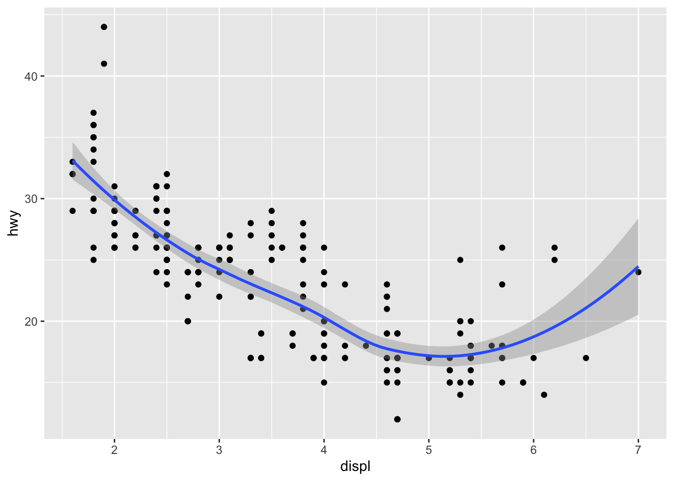
These graphs don’t look different because they are identical in meaning. The top code is much more concise code, as the data and aesthetics are described in the ggplot portion and the point and smooth functions are how the data will plot.
3.4.6 Question 6: Recreate the R code necessary to generate the following graphs.
## `geom_smooth()` using method = 'loess' and formula 'y ~ x'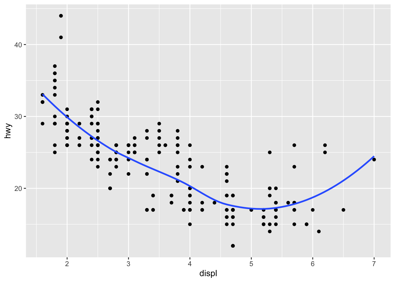
ggplot(data = mpg, mapping = aes(x = displ, y = hwy)) +
  geom_point() +
  geom_smooth(data = mpg, mapping = aes(x = displ, y = hwy, group = drv), se = FALSE)
## `geom_smooth()` using method = 'loess' and formula 'y ~ x'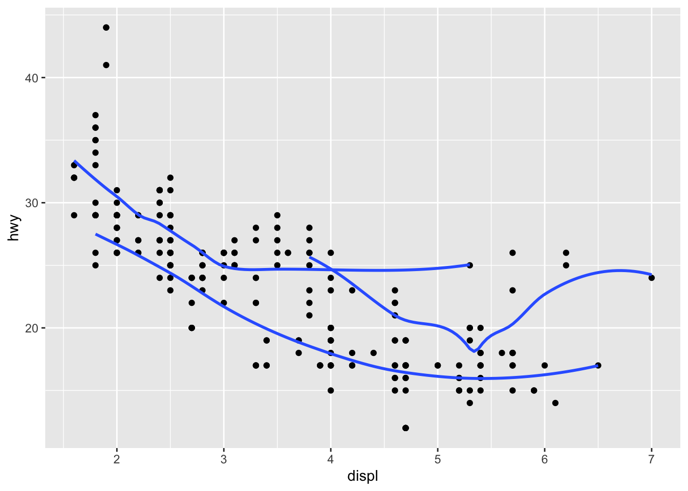
ggplot(data = mpg, mapping = aes(x = displ, y = hwy, color = drv)) +
  geom_point() +
  geom_smooth(data = mpg, mapping = aes(x = displ, y = hwy, group = drv), se = FALSE)
## `geom_smooth()` using method = 'loess' and formula 'y ~ x'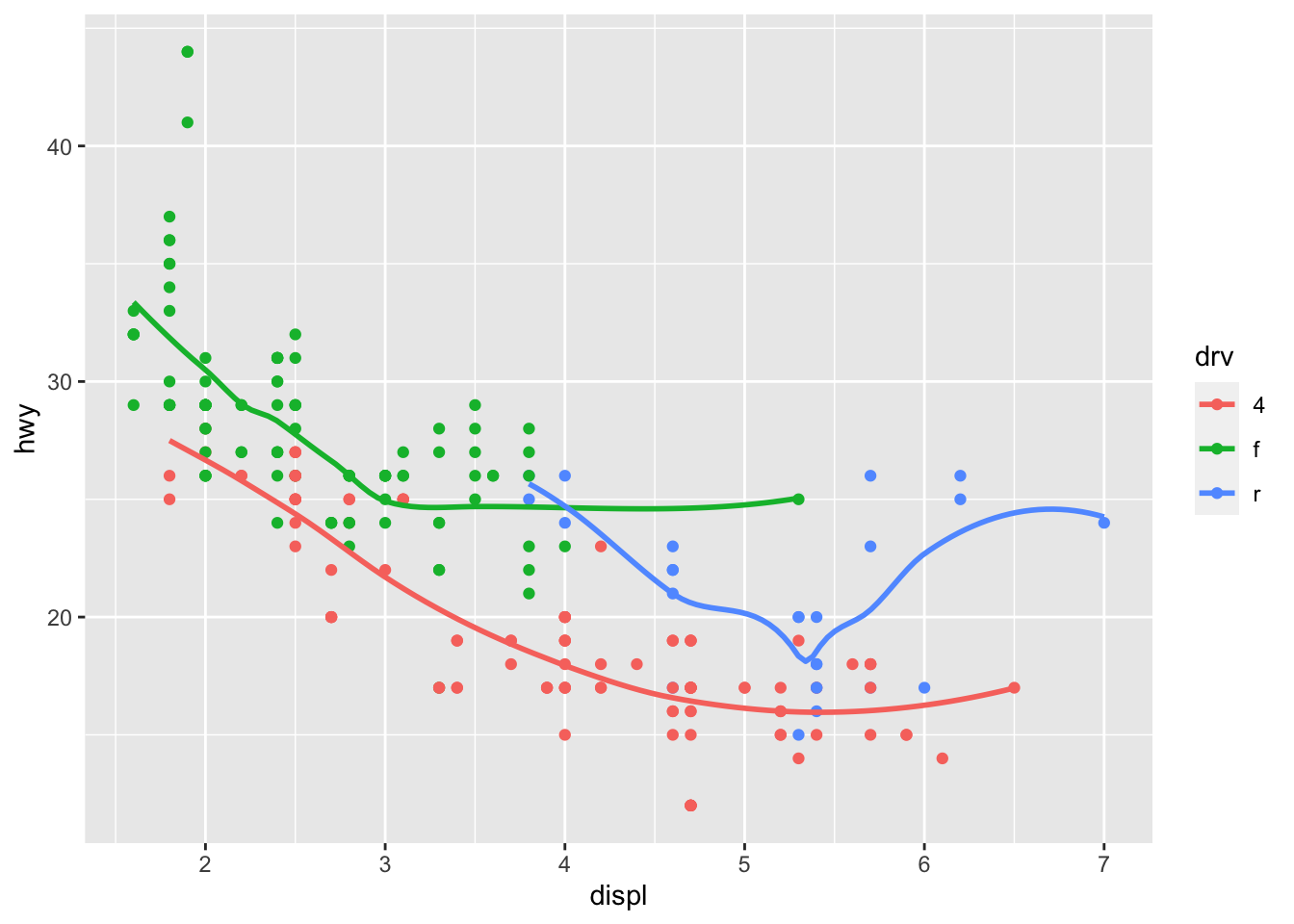
ggplot(data = mpg, mapping = aes(x = displ, y = hwy)) +
  geom_point(mapping = aes(color = drv)) +
  geom_smooth(se = FALSE)
## `geom_smooth()` using method = 'loess' and formula 'y ~ x'
ggplot(data = mpg, mapping = aes(x = displ, y = hwy)) +
  geom_point(mapping = aes(color = drv)) +
  geom_smooth(se = FALSE)
## `geom_smooth()` using method = 'loess' and formula 'y ~ x'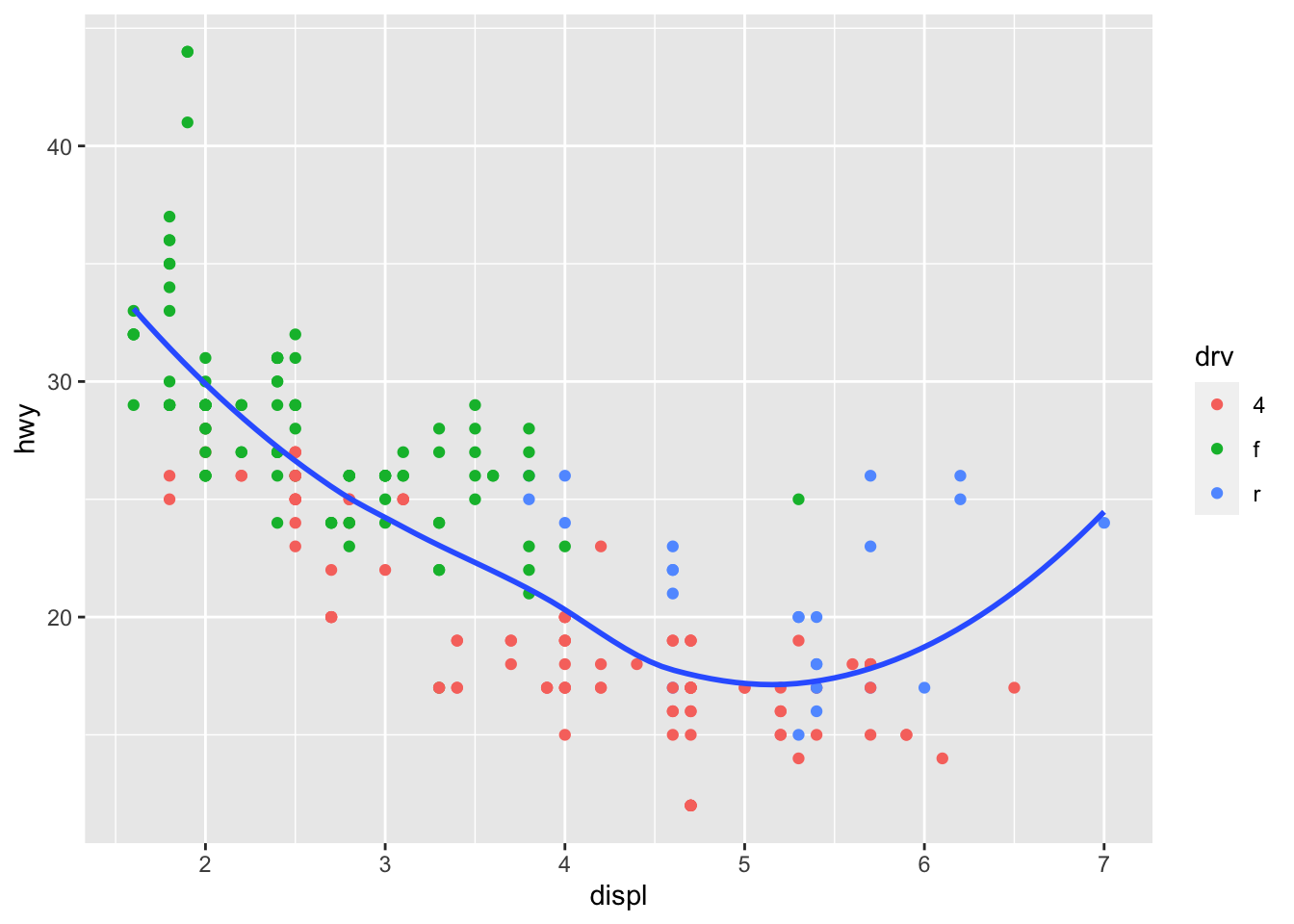
ggplot(data = mpg, mapping = aes(x = displ, y = hwy)) +
  geom_point(mapping = aes(color = drv)) +
  geom_smooth(mapping = aes(x = displ, y = hwy, group = drv), se = FALSE)
## `geom_smooth()` using method = 'loess' and formula 'y ~ x'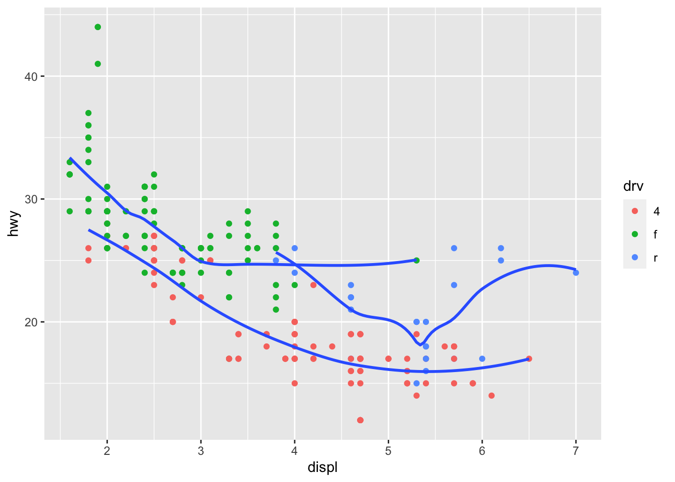
ggplot(data = mpg, mapping = aes(x = displ, y = hwy)) +
  geom_point(colour = "white", size = 4) +
  geom_point(mapping = aes(color = drv), size = 1.5)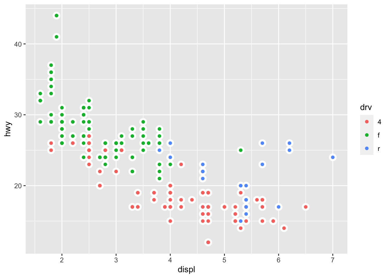
3.5 Chapter 3.7.1 Exercises
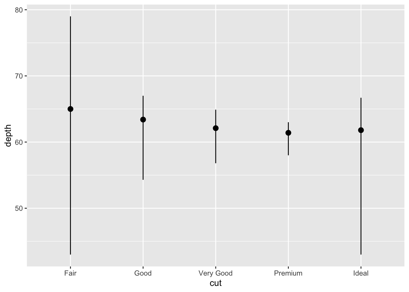
3.5.1 Question 1: What is the default geom associated with stat_summary()? How could you rewrite the previous plot to use that geom function instead of the stat function?
The default geom is pointrange.
ggplot(data = diamonds) +
  stat_summary(
    mapping = aes(x = cut, y = depth),
    fun.min = min,
    fun.max = max,
    fun = median
  )
## No summary function supplied, defaulting to `mean_se()`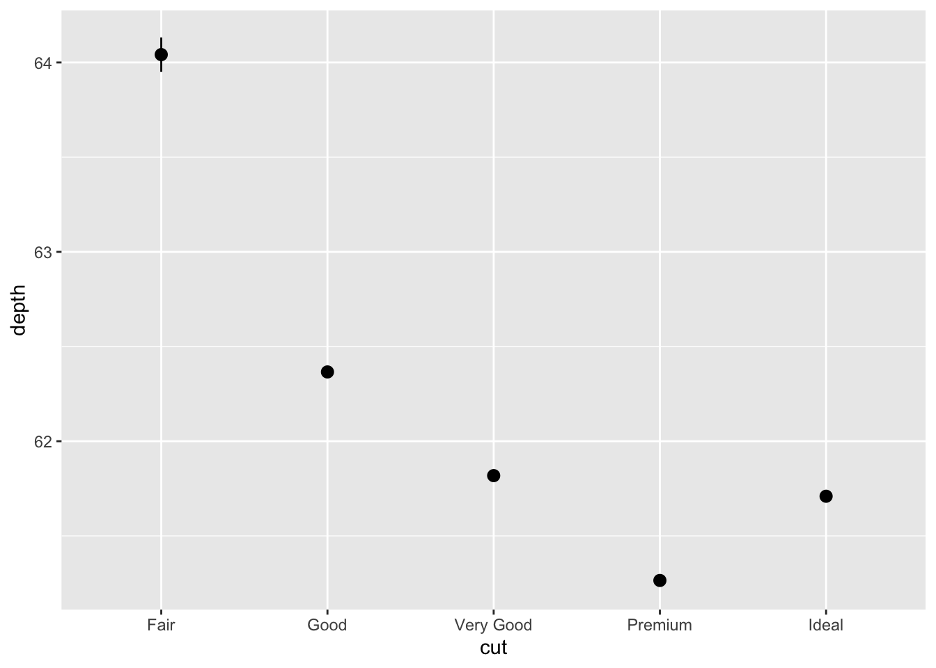
3.5.2 Question 2: What does geom_col() do? How is it different to geom_bar()?
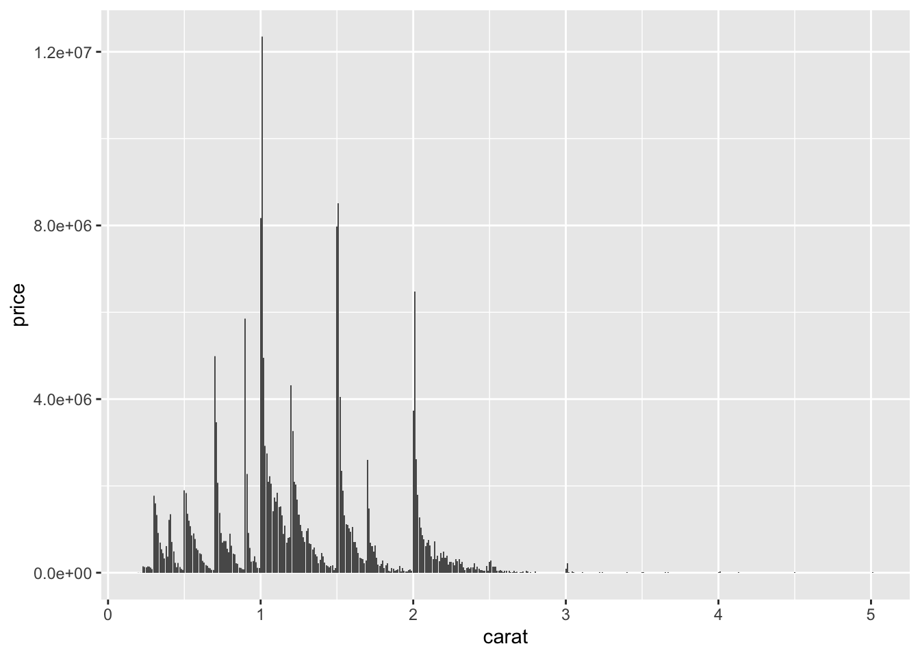

They create the same graph but have different defaults; geom_bar only expects an x variable wherease geom_col requires x and y.
3.5.3 Question 3: Most geoms and stats come in pairs that are almost always used in concert. Read through the documentation and make a list of all the pairs. What do they have in common?
geom_bar() -> stat_count() geom_bin2d() -> stat_bin_2d() geom_boxplot() -> stat_boxplot() geom_contour_filled() -> stat_contour_filled() geom_contour() -> stat_contour() geom_count() -> stat_sum() geom_density_2d() -> stat_density_2d() geom_density() -> stat_density() geom_dotplot() -> stat_bindot() geom_function() -> stat_function() geom_sf() -> stat_sf() geom_sf() -> stat_sf() geom_smooth() -> stat_smooth() geom_violin() -> stat_ydensity() geom_hex() -> stat_bin_hex() geom_qq_line() -> stat_qq_line() geom_qq() -> stat_qq() geom_quantile() -> stat_quantile()
You can see that each geom type has a stat associated with it; specific to the name and type of graph it creates.
3.5.4 Question 4: What variables does stat_smooth() compute? What parameters control its behaviour?
stat_smooth() computes: predicted values (y, x), confidence interval around the mean (ymin or xmin and ymax or ymin), and the standard error (se).
The behavior of stat_smooth() is controlled by: na.rm, method, formula, se, method.args
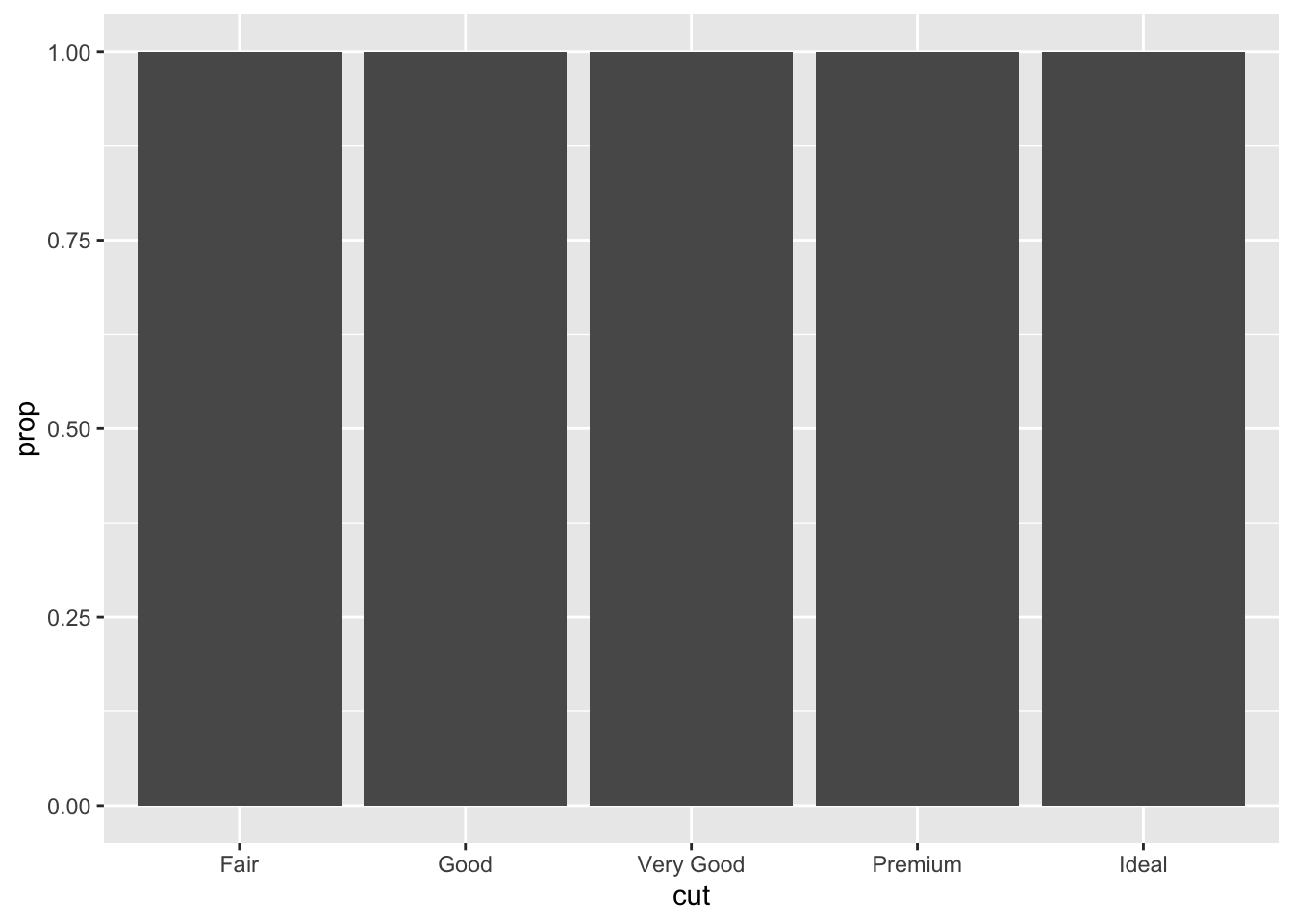
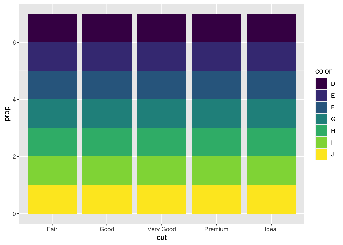
3.5.5 Question 5: In our proportion bar chart, we need to set group = 1. Why? In other words what is the problem with these two graphs?
If group = 1 is not included, it will set the height of all the bars as the same. The issue is that the proportions are set inside the groups in this code.
3.6 Chapter 3.8.1 Exercises
3.6.1 Question 1: What is the problem with this plot? How could you improve it?
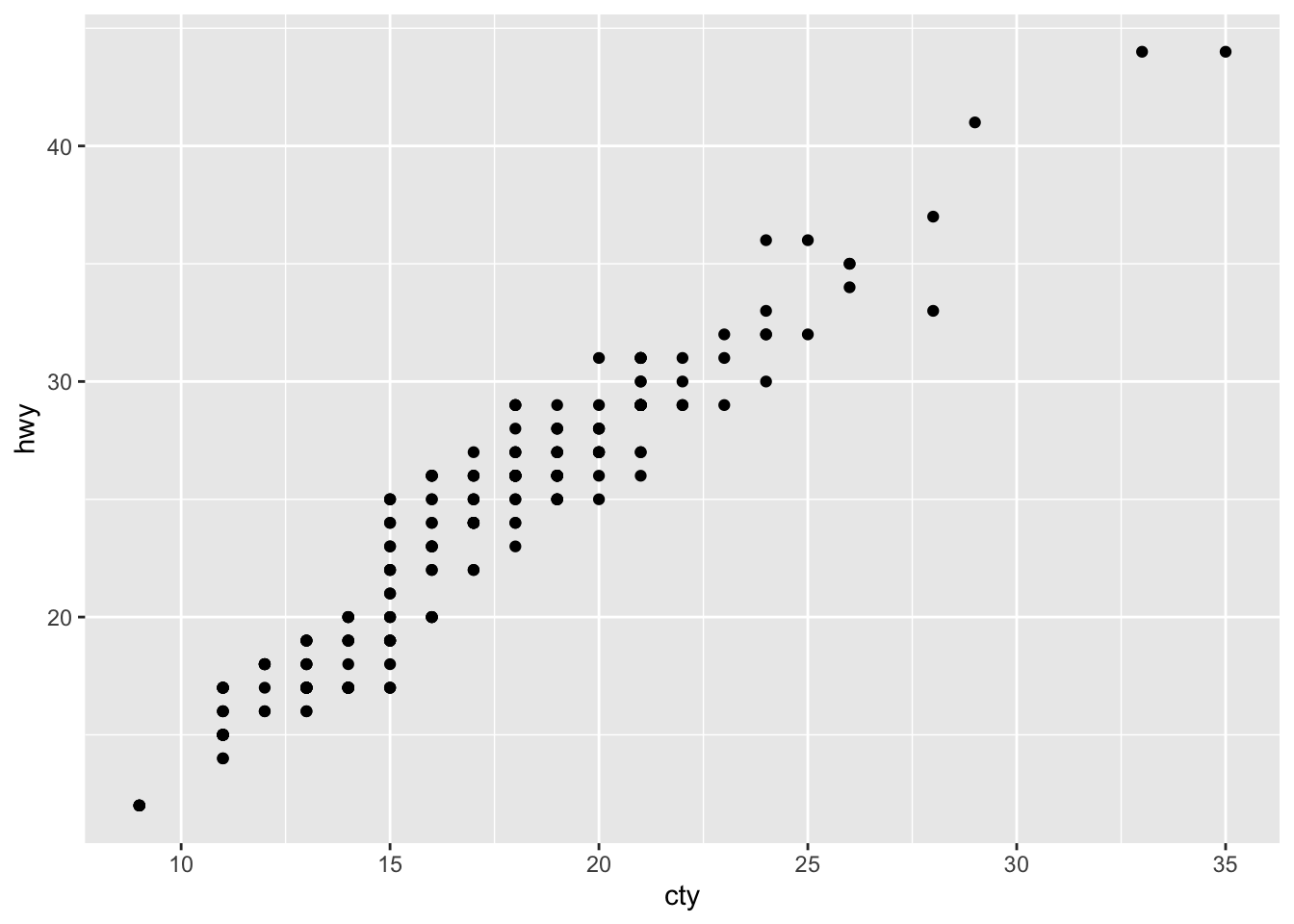
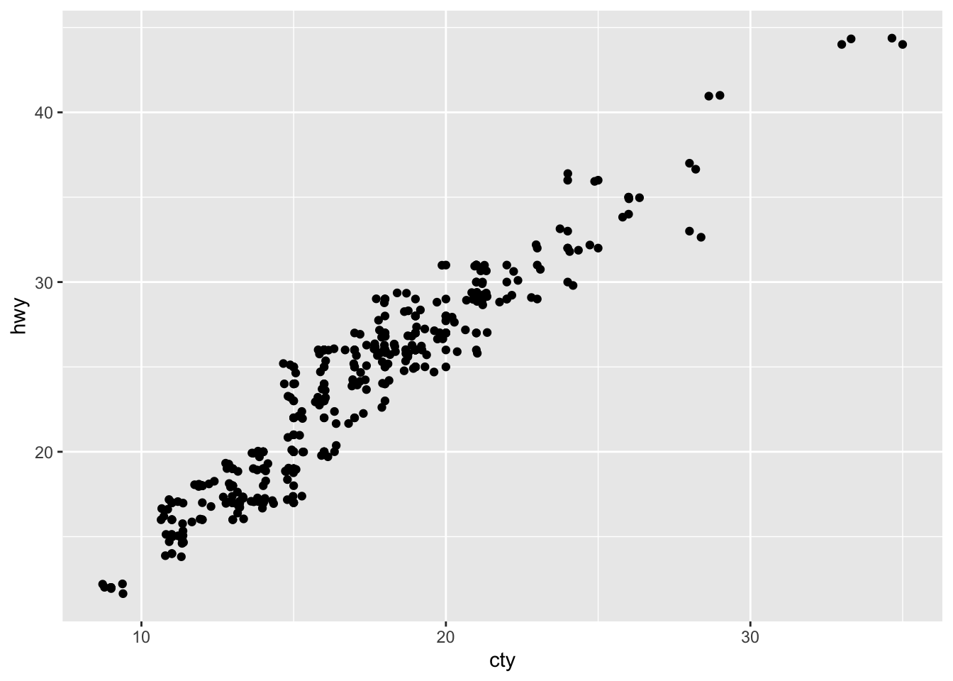
The use of geom_jitter() improves this plot because it makes it more visible to see the overlapping points. Without it, there is the issue of overplotting and the graph is less obvious.
3.6.2 Question 2: What parameters to geom_jitter() control the amount of jittering?
width and height: the amount of vertical and horizontal jitter
3.6.3 Question 3: Compare and contrast geom_jitter() with geom_count().
geom_jitter and geom_count both are useful in overplotting situations as they both reveal overlapping points. Geom_jitter makes it visible the points that overlap whereas geom_count provides the number of points overlapping at each location on the graph.
3.6.4 Question 4: What’s the default position adjustment for geom_boxplot()? Create a visualisation of the mpg dataset that demonstrates it.

The default position adjustment for geom_boxplot() is “dodge2.”
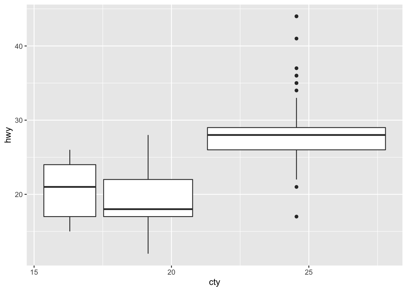
Both graphs are identical, showing that the default position is ‘dodge2.’
3.7 Chapter 3.9.1 Exercises
3.7.1 Question 1: Turn a stacked bar chart into a pie chart using coord_polar().
ggplot(data = diamonds) +
  geom_bar(
    mapping = aes(x = cut, fill = cut),
    show.legend = FALSE,
    width = 1
  ) +
  theme(aspect.ratio = 1) +
  labs(x = NULL, y = NULL)+
  coord_flip()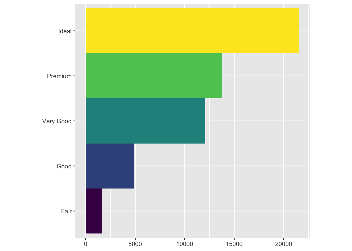
ggplot(data = diamonds) +
  geom_bar(
    mapping = aes(x = cut, fill = cut),
    show.legend = FALSE,
    width = 1
  ) +
  theme(aspect.ratio = 1) +
  labs(x = NULL, y = NULL)+
  coord_flip()+
  coord_polar()
## Coordinate system already present. Adding new coordinate system, which will replace the existing one.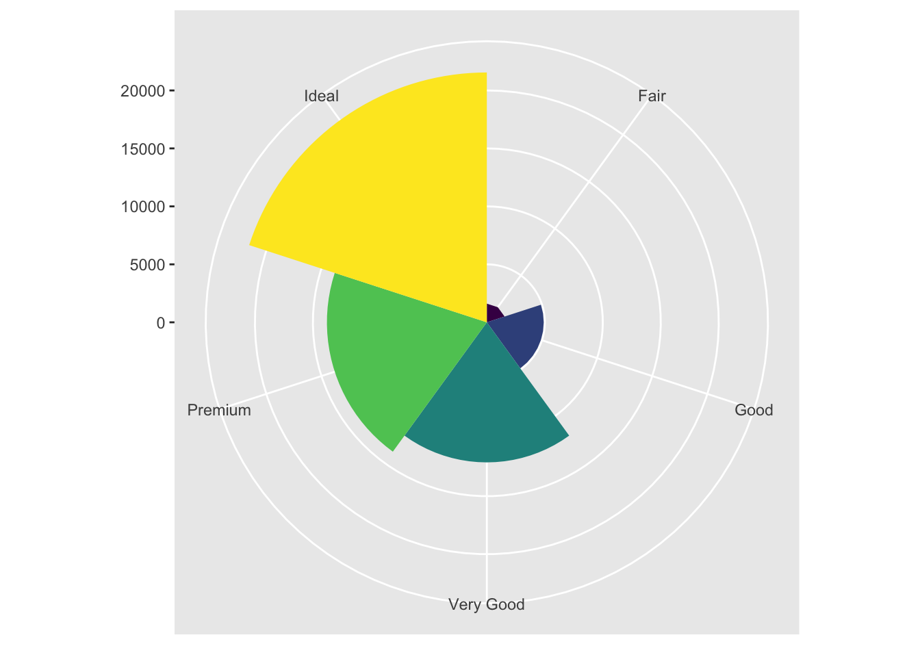
3.7.2 Question 2: What does labs() do? Read the documentation.
labs() adds labels to your graph. It provides options to set a title, subtitle, caption, tag, or x/y labels.
3.7.3 Question 3: What’s the difference between coord_quickmap() and coord_map()?
coord_quickmap() is a quick approximation that preserves straight lines for the 2D plane from the spherical earth (so is better for smaller areas close to equator); coord_map(), on the other hand, requires a lot of computation because it projects a portion of the earth onto a 2D plane but doesn’t preserve straight lines.
3.7.4 Question 4: What does the plot below tell you about the relationship between city and highway mpg? Why is coord_fixed() important? What does geom_abline() do?
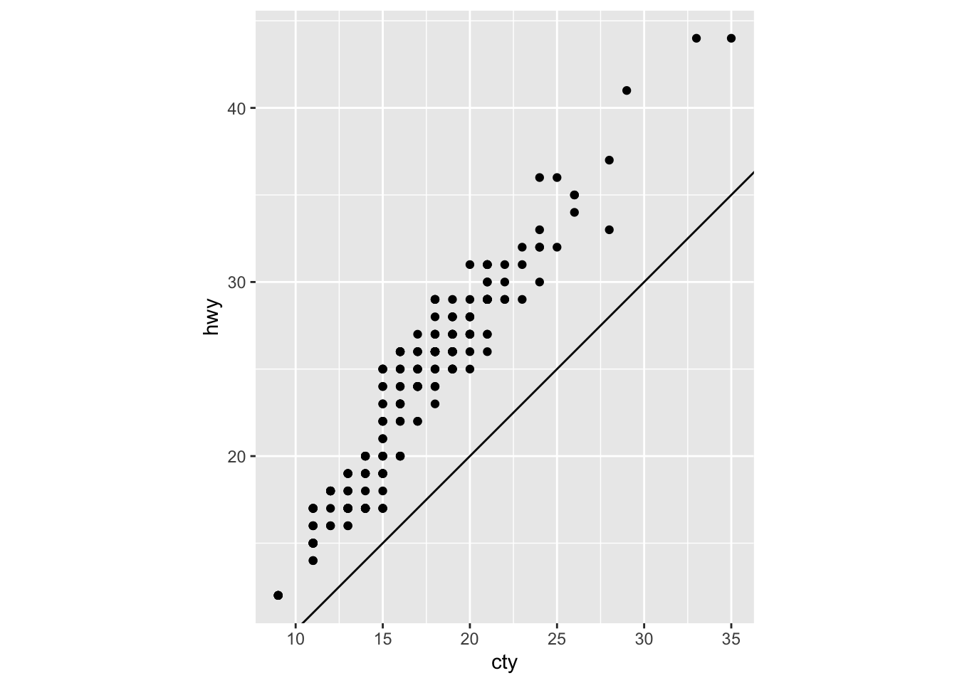
The plot tells you that there is higher highway miles per gallon compared to city miles per gallon for all cars. coord_fixed() is important because it does not stretch out the graph so that it is a perfect square. It better shows the actual numerical value’s position for hwy/cty. geom_abline() adds a reference line for the correlation between hwy and cty.